How it started
I have been using QWERTY and ЙЦУКЕН for many years while being focused on things other than typing efficiency. The speed was average. I typed using two fingers without looking at the keyboard. At some point, the environment became mature and stable enough for me to deeply invest in skills that provide slow yet steady benefits.
I decided to learn touch typing - supposedly the most efficient input method where all fingers are utilized. My goal was to improve ergonomics and typing speed and to generally think less about the keyboard. The better you type, the less typing difficulty holds you back. That means less mental overhead, more experiments, and more real-world feedback as opposed to simulations in your mind.
However, it didn’t go well with standard layouts.
It’s like learning a new layout. Typing flow is based on muscle memory, not on the location of the keys. That means we’re at least at the third layer of abstraction. The first layer is formed by the physics and position of keys, the second layer is introduced by software which maps symbols to keys, and the third layer is entirely made by you - it is how you reach those symbols. People don’t interact with QWERTY directly, they use their behavioral model on top of it. Touch typing is a completely new model compared to typing with two fingers, and I am convinced that the reuse of the same keyboard layout gives no advantage. It actually makes learning harder as it creates a conflict between old and new habits, defeating the ability to notice mistakes.
But that layout is bad. QWERTY is unergonomic by design. Designed in the 1870s (!) to prevent mechanical typewriter jams, it deliberately increases finger movement and places frequent keys in hard-to-reach positions (causing sideways wrist bending, etc). ЙЦУКЕН’s main idea is to put all common keys in the center, which is literally the opposite of the touch typing principle. I don’t think I need much theory here - feel free to type “the right way” (illustrated above) and see how inconvenient it is compared to “hacking” bigrams intuitively via 4 or 6 fingers.
There should be a better alternative. To find it, I must define scope and metrics and try to maximize them while covering all possible use cases.
Scope
ANSI keyboards. Custom hardware looks too time-consuming and fragile. The stability, popularity and affordability of existing keyboards grant much independence from the physical world. Their widespread adoption and production won’t let them disappear for decades. An ANSI keyboard can be found easily regardless of the physical location or time of day. No matter what happens - pick one for $5 and you’re ready to go. Widely used on laptops, popular as an external option for phones, TVs, they’ll likely outlive the form-factor of PCs. The layout can be ported to a European-style or “ergonomic” keyboard, although I must focus on one option, and the choice is ANSI.
Two-handed. Contrary to popular belief, two-handed typing is not superior to one-handed typing. They have completely different use cases. Two-handed method excels if the best use for the spare hand is to speed up typing (but not to utilize mouse / hold laptop / use phone / etc). Generally, it requires more concentration, less multitasking, stricter physical conditions and keyboard-centered software, but provides obvious benefits.
Latin-centric. A multilingual environment forces us to make trade-offs between languages. In such cases, English will be prioritized. Other languages must not add context to the key placement.
General-purpose with modal editing in mind. Account for all scenarios, do not over-optimize for specific language dialects. Do not plan continuous recalibration or adjustments; the layout is not a process but a result, try to achieve it once and forever like QWERTY did.
Personal. Presumably the keyboard should reflect biological and mental factors which are a bit different among different people. I have no intention to research the significance of that difference or to make the model suboptimal for myself in favor of a larger audience (if such conflict exists).
Result
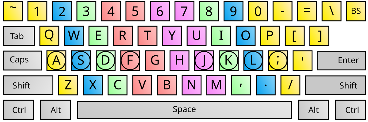
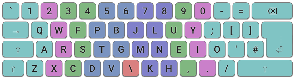
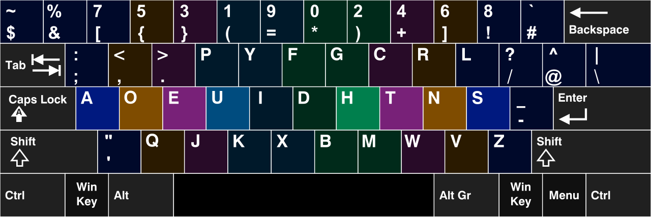
Yurmak-EN layout

   | 1   2   3   4   5   6   7   8   9   10  11  12  13  14
------------------------------------------------------------
AA | *   1   2   3   4   5   6   7   8   9   0   -   =   \
AB | `   #   ~   !   $   ^   %   [   ]   <   >   +   =   @
   |
BA | ESC q   w   f   p   b   j   l   u   y   :   (   )   BSP
BB | ESC Q   W   F   P   B   J   L   U   Y   ;   {   }   BSP
   |
CA | CPS a   r   s   t   g   m   n   e   i   o   "   RET
CB | CPS A   R   S   T   G   M   N   E   I   O   '   RET
   |
DA | SHF x   c   d   v   z   k   h   ,   .   /   TAB
DB |     X   C   D   V   Z   K   H   |   &   ?   TAB
   |
EA | CTL SUP AGR SPC ALT RCT
EB | CTL SUP AGR _   ALT RCT
--------------------------------------------------------------
column header -  horizontal key position
row header, letter 1 - vertical position, top to bottom
row header, letter 2, A - no modifier
row header, letter 2, B - Shift modifier
XKB config may be found here.
Action keys
Escmoved to the left of top alpha row (previously Tab)Controlmoved to the left of middle alpha row (previously Caps)Shiftstays on the left of bottom alpha row
This plays well with apps that rely on hotkeys, especially modal programs like vim. It is not a coincidence - just look at the older keyboards they were designed for.
You may notice that even modern programs have not recalibrated and use the same keys. Surely Control is more useful than Caps lock for most people.
Backspacegoes to the right of top alpha row (previously backslash)Enterstays on its original position - right of the middle alpha row.Tabis placed on the right of bottom alpha row (previously Right Shift)
Backspace is used more than backslash, so I move it to the more reachable position. However, it should not be used as frequently as one may think, because character deletion is also covered by case-specific combos like ctrl+w, ctrl+n, x, etc.
Tab is widely used for auto-completion and indentation. Tab is not a modifier key, it is pressed sequentially and involves some semantic pause - it is either a gap itself or it introduces unpredictable branching. Combinations with tab do not include right-side modifier and action keys. I find this position perfect for Tab as it requires some movement, yet that movement is very convenient and frequent. Right shift is superseded completely.
Enter follows similar rules: used frequently, pause is assumed, no common bigrams with the right pinky.
Window manager keyintroduced. It takes the left place on the thumb row (previously Control)Layout switch keyintroduced and placed as the second to the left key of space. (previously OS key)
Window manager (OS) key is for window arrangement, app launcher, device management (brightness, volume) and other inter-application stuff such as clipboard. This, by design, requires some distraction, so the key is farther than other modifiers yet is easy to reach.
Layout switch key is used to switch between keyboard layouts. Occupies a spare key, which is reachable yet not suitable for combos due to high concentration of special keys near edge of the keyboard.
AltGrtakes its static place under the left thumb, near Space (previously Left alt)Left alt(Meta) appears under right thumb, near Space (previously Right alt)Right controlstays on its inconvenient place of 2nd key to the right of Space.
AltGr allows one to type extra characters that do not fit on the base layer, but correspond to some base-layer character, for example, α or á can be mapped to a. Non-English layouts that have more than 26 characters should place extra characters there to keep punctuation keys stable. AltGr can also be used with modifier keys, forming an Alternative modifier combo. If possible, keyboard with a reasonable space length should be chosen in order to make such movement convenient.
Alt is discouraged and should not be used in applications unless you have a very good reason to do so. We opt for modal flow and already have an application-level modifier key, so, for the sake of simplicity, Control should be used exclusively. Key is deprioritized in its reachability.
Right control provides compatibility with cheap keyboards that cannot handle certain combos due to hardware limitations, such as Ctrl+Shift+D being impossible to type because manufacturers did not give enough capacity to Caps+Shift prefix. It’s quite ironic that our layout is shaped by the same problem as QWERTY was 150 years ago, but, luckily, problem is minor nowadays and does not degrade ergonomics significantly. Discouraged in favor of left control.
Key meaning summary:
WM key- inter-application modifier layerAltGr,Shift- character modifier layerCtrl,Alt- application modifier layer- Keys without modifier pressed are transmitted to the application directly
English keys
The evolution path is quite rich.
QWERTY -> Dvorak -> Colemak -> Colemak-DH -> Yurmak
Alphanumeric characters are taken from the Colemak-DH layout.
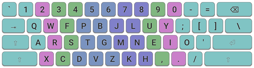
Colemak layout family is state-of-the-art in ergonomic layouts, it accumulated lots of efforts, is battle-tested and has a large community.
One of its main advantages is that it reduces finger movement by placing the most frequently used letters in the English language on the home row, which leads to faster typing speeds and reduced finger strain. This layout also aims to minimize bigrams that are uncomfortable, promotes finger rolls and hand alternation. Additionally, Colemak retains most of the QWERTY key positions for less frequently used letters, making the transition easier for those already familiar with QWERTY.
Original Colemak was created in 2006 with computational assistance. Colemak Mod-DH is a minor patch to Colemak which discourages lateral movement a bit more, therefore keys D and H are moved. I find this to be the right thing to do.
This is a short practical review, detailed theory may be found in the “Research” section.
Punctuation characters are derived from Colemak-DH with the following modifications.
[]swapped with(), Shift-layered{}remains untouched;swapped with:- same key, inverse Shift effect"swapped with'- same key, inverse Shift effect\moved to former backspace to compensate Action key remap
I am fairly sure in my willingness to promote parentheses, colon and double quotes over their counterparts in all contexts, including programming, casual language and prose. Observations show me that old placement is outdated due to changes in our language - old one really makes sense when you look at texts written a hundred years ago.
Colemak defines the location of Latin alphabetic characters, numbers and a few punctuation signs, nothing more. It is understandable since the layout aims to be universal. I have considered various Colemak modes that cover different locales, special characters and action keys, but they all lack thoroughness and background that makes base Colemak great. That’s the reason for me to continue modding further.
Special symbol keys
At first I wanted to generate the optimized symbol layout programmatically with some genetic algorithm at its core. However, such a layout would lack important properties, such as semantic key grouping and positional meaning of keys. In a typical computer-generated layout position of one specific key is pseudo-random and uncontrollable, it means nothing separated from exact training set and full list of keys. Any correction in the generation process or data rearranges all keys unpredictably.
I am convinced that symbols, unlike alphabetic characters, keep some value hidden in their relative position, and that value is not limited to learning or memorizing, but lies in usage in general. A certain position fits mental model behind the keys better. For example, <= and => need movements that look similar, left brace needs to be the left one physically, and such patterns should be consistent across all paired signs. That’s why keys should be arranged manually. You may find the result below.
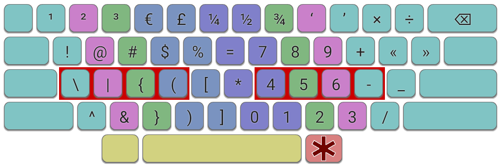
   | 1   2   3   4   5   6   7   8   9   10  11  12  13  14
------------------------------------------------------------
AA | *   1   2   3   4   5   6   7   8   9   0   -   =   \
AB | `   #   ~   !   $   ^   %   [   ]   <   >   +   =   @
BA |                                         :   (   )
BB |                                         ;   {   }
CA |                                             "
CB |                                             '
DA |                                 ,   .   /
DB |                                 |   &   ?
Looks good? Here is how it was made.
Step 1. Tokenize - group keys that are used together as one operator.
Here is my list of tokens:
- Generic punctuation:
.,-:;?!#%$ - Enclosure:
()[]{}<>''""`` - Logical:
!<><=>===||&&??|&!!<> - Arithmetic:
+-*/.^=+=-=*=/=++-- - Figures:
=>->:):( - Programming:
~/::>><<${}$()/**///<--</@\&>
Step 2. Find usage patterns for each token.
My layout was formed by a trial-and-error method and I do not remember them all, but these observations come to my mind now:
- Special keys are not so frequent.
- All of them are usually placed near Space. Punctuation keys have space on the right side
- Arithmetic, logical and enclosure sequences reside near numbers
- Number is likely from the left side (our numeric system works in a way that leading digit is likely to be small)
- Semicolon seldom follows space. In computer contexts, it often follows enclosure
- Logical tokens are often enclosed
- Escape token is usually used with other tokens
Step 3. Determine token frequency and arrange keys.
Ideally tokens of one group should reside near each other. Token itself must be easy to type. Common combinations with token must be easy to type. In practice,
- Base layer is better than Shift layer
- Token should not be on the Shift layer partially
- The close to middle finger on the home row the better
- Inward roll is better than outward roll which is better than no roll at all
- Two-hand movement is better than one hand movement with large distance
- Double-tapped keys should not be assigned to pinky
Theory above is abstracted from character frequency, you can reuse it with your own data. I recommend running a keylogger to analyze that frequency and then applying trial-and-error method until you find the best placement. It’s not so hard since number of good combinations is fairly low. Basically we have very strong bigrams and a few well-accessible keys. The best effect will probably come from keys D9-D11, A2-A4, A7-A13.
I would like to emphasize the promotion of characters ~ ! | & : ", making = independent from Shift, placing _ on Space and moving * to the base layer on the left for good bigrams. In my opinion, all listed tokens are covered really well and the list itself says enough about key placement.
Russian keys
The Russian layout matches the English one phonetically whenever possible. It uses the same amount of keys, keeps special character positions constant, and offloads some keys to the AltGr layer.
Yurmak-RU layout

   | 1   2   3   4   5   6   7   8   9   10  11  12  13  14
------------------------------------------------------------
AA | *   1   2   3   4   5   6   7   8   9   0   -   =   \
AB | `   #   ~   !   $   ^   %   [   ]   <   >   +   =   @
   |
BA | ESC ь   ы   ф   п   б   ж   л   у   я   :   (   )   BSP
BB | ESC Ь   Ы   Ф   П   Б   Ж   Л   У   Я   ;   {   }   BSP
   |
CA | CPS а   р   с   т   Г   М   Н   Е   И   О   "   RET
CB | CPS А   Р   С   Т   Г   М   Н   Е   И   О   '   RET
   |
DA | SHF ч   ц   д   в   з   к   х   ,   .   /   TAB
DB |     Ч   Ц   Д   В   З   К   Х   |   &   ?   TAB
   |
EA | CTL SUP AGR SPC ALT RCT
EB | CTL SUP ARG _   ALT RCT
--------------------------------------------------------------
column header -  horizontal key position
row header, letter 1 - vertical position, top to bottom
row header, letter 2, A - no modifier
row header, letter 2, B - Shift modifier
XKB config may be found here.
Why phonetic layout? Well, I think that should always have been the standard for people that use multiple layouts, one of which is primary. Placing letters that produce the same sound, look exactly the same, and have similar usage patterns, in different places, as well as introducing excessive modality of special keys, is pure absurd. It is hard to learn, doesn’t scale and gives bad usability for the ordinary user. One fair advantage is that it opens up the possibility to micro-optimize key positions for the target language, but, firstly, such possibility is historically not used (one layout is almost always not-so-optimal QWERTY), and secondly, it can be done only at some constant mental cost, so the entire thing is questionable.
Mapping summary:
- Direct equivalents:
фпбжлуарстгмнеиодвзкх - Approximations:
q->ь,w->ы,y->я,x->ч,c->ц - Second layer:
ь->ъ,:->ш,(->щ,"->э,,->ю
As Yurmak is English-centric, base layout has 26 keys. Almost all of these keys sound the same in English and in Russian. Non-matching and infrequent keys were evicted to the second layer, to the top of either naturally paired character or punctuation sign. One lucky fact is that in Cyrillic and Latin languages similar characters also have similar bigrams and comparable usage frequency, so our phonetical arrangement greatly benefits from optimizations made into Colemak.
ш, щ, э, ю positioning was inspired by ЙЦУКЕН but changed to the edge of the current alpha layer.
One might say that the entire two-layer system is suboptimal, but that’s the trade-off to keep efficiency overall. If Russian layout was more important, I would still keep phonetic principle, but use Cyrillic characters as the base. Moreover, new languages can be rapidly added and adopted - you already know position of their keys since languages share many sounds.
Modal remapping
Many programs use standard shortcuts for left-right-up-down paradigm. Since HJKL and WASD are now broken, a new, unified way is proposed:
N       E       I       O
LEFT    DOWN    UP      RIGHT
index   middle  ring    little
NEIO are on the home row under fingers by default. E is down, I is up - that’s because down is more frequent since user usually starts at the top, and E is easier to press.
In apps with vim-like keybinds, HJKL keys are now free, so we can do a circle remap in a safe and consistent way, and even create new synonymous mnemonics for known actions on the new positions.
H(previously O aka Open) - HatchJ(previously E aka End) - Jump [forward]K(previously N aka Next) - Key [point]L(previously I aka Insert) - Lay, visual mnemonic
Search and Insert (K and L) handle common actions as they’re very easy to reach, H is a bit less loaded, J is the rest.
Sometimes, movement is three-dimensional, for such cases, there is an extended version:
M                   "
FORWARD/ZOOM-IN     BACKWARD/ZOOM-OUT
proxiMity
ISO layout
The proposed layout does not have an exact ISO variant, however, I’ve used such keyboards enough and am willing to share some ideas. ISO keyboards have an extra key near Left Shift and move one key from the top of Enter to the home row. Here is how authors of Colemak-DH think keys should be arranged:
My criticism:
- The new key on the home row is ideal for
Backspace, not# - The extra key should better be dedicated to some modifier (possibly
AltGr) - The extra key could be moved to the left, so that
Zkeeps its central place (not sure, didn’t test much)
Phones
I use Unexpected Keyboard on my Android phone. It is a free highly-customizable keyboard that replace long taps with swiping keys towards the corners.
The alphabetic layout is ported literally with the base of 26 characters. On phones, typing is different - people type with two fingers and central position is the best one. This contradicts the principles behind Colemak and is suboptimal, but I value this unification more than benefits that separation of layouts could give. If this sounds irrational, imagine what happens if “the most optimal” layout is chosen every time. By now, we would have 4 completely different layouts (two per language) instead of just one. The effective power of learning and practice would be divided by 4 because we can use only one layout at a time. Situational ergonomics won’t outplay the dense practice given by one unified layout.
Keyboard is narrow to keep keys larger thus easier to hit, otherwise, the keyboard is really hard to use.
Middle row is elevated compared to standard phone QWERTY layouts to enhance reachability. Previously, the top row was more convenient, containing 10 characters versus the middle row’s 9. In Yurmak, the home row holds more characters than the top row, requiring fingers to rest closer to it. This is achieved through margins and strategic positioning of the number row.
Digits are moved to the bottom row to save precious screen space and elevate other characters. From the ergonomic point of view, this is essentially a boost to content visibility, because alphabetic keys must be positioned high enough, yet screen space is too valuable to place digits at the top of them.
Introduced Ctrl and Esc which are very useful for console applications (yes, I use vim over ssh on the phone). They get not-too-prominent but still convenient positions on the bottom row.
CTL    ESC        SPC       RET     BSP
1   2   3   4   5   6   7   8   9   0
Special keys had to be rearranged. I’ve tried to do it in a consistent manner, preserving relative grouping as much as possible.
Unstable: position of special keys is not perfect and may change in the future.
- Keyboard has fewer keys horizontally than before -> Excessive keys got their place on the second layer of the top row.
- Relocation of digits broke bigrams with them -> Special keys that are used with numbers frequently have been moved to the bottom.
- Gestures introduced more space on the home row -> Other characters from the top row moved to the home row due to its enhanced reachability.
For Russian, the layout is still based on 26 keys so we can reuse muscle memory, which means that 7 keys get evicted to the second layer. The location of some of them is slightly changed since phone keyboard benefits from reduced width, but their relative position is preserved.
Thoughts and observations
Learning process
Plan. Mastering new layout may be complicated and overwhelming at the beginning. One may follow stages below to facilitate the progress.
- Evaluate ergonomics, get familiar with new movements
- Memorize the order the of keys verbally
- Train on a website like monkeytype until ~15 wpm
- Introduce new layout as another option, use it when ethically and functionally appropriate until you reach some degree of comfort
- Switch fully
- Practice further
Stage 1 took nearly a month of casual research, stages 2-3 lasted two evenings of active practice, stage 4 was on track for three months (could have been a lot quicker, the purpose was not to do short-term harm to my occupation). After three more months, typing became fluent and unnoticeable. In total, it took me 8-10 months to master the new layout and surpass initial QWERTY experience across all metrics.
More than just a layout. It was hard to get used to a new keyboard layout. But that’s not the case anymore - now I can adopt new layouts much easier (tested on Dvorak). If you were on the same track but left, you may overestimate future difficulty assuming further progress will be as hard as the first attempt. More importantly, your understanding of ergonomics and physical conditions gets boosted. Mine went from complete ignorance to a firm grasp on comfort of keys, bigrams, movements - what exactly is unergonomic and how to improve it.
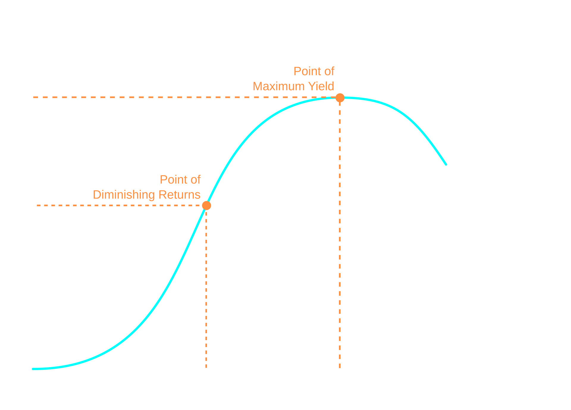
Diminishing returns. Switching has a cost. Firstly, it requires some dedication, secondly, it inevitably slows down typing for some time. Such a pivot in the learning path nullifies further improvements in the current flow and partially invalidates efforts made towards it (so-called Principle of Increasing Marginal Switching Costs). Imagine you were on path A and know that path B is more optimal. However, in order to get onto B you must start from the beginning. From the marginal cost perspective, every step you make on path A decreases the profit you get from switching to path B. Moreover, each subsequent chance by itself is usually less valuable (Optimization Plateau). At some point, there is no more reason to switch paths at all. In our case:
- One should change layout only if this leads to a significant improvement.
- One should change layout as early as possible, if they ever will.
A methodology to estimate this would have to account for lots of variables and marginal factors, producing questionable conclusions. Although the approximation can definitely be done: after initial switch, amount of spent effort is in inverse proportion to the benefits given by the further effort. Surely, transition from QWERTY to an ergonomic layout is beneficial in most cases, but switching between Colemak, Dvorak, Workman, CarpalX layouts in favor of minor ergonomic gains may be suboptimal.
Software support
Software support is good, but deviation from the standard is still a liability. Operating systems have an ‘input layer’ that abstracts printed symbols from their physical position. Almost all applications take these symbols as their input, leaving key placement up to the user. Such a model works well with both local and remote destinations in a consistent, predictable manner - keys are just moved to the new locations. Shortcuts are remapped too.
But how do designers assign symbols to actions? Hopefully, they don’t roll the dice but express either semantic or positional meaning. Examples of semantic-based assignment are d for delete, p for paste, go for go, etc. Due to the fact that semantics is linked to the language, in our case these keys get even more convenient positions, as the layout is heavily optimized for the general-purpose English. Positional assignment, on the contrary, is problematic, because keys lose the desired placement. WASD and HJKL are great examples. First line of defense is application itself mapping to physical keys (although that’s very rare), second is partial compatibility provided by Colemak, and anything further requires key remapping.
Imagine remapping movement keys over SSH for the root account that is also used by colleagues, mounting configuration files into containers, writing patches for programs that have mappings hardcoded (and compiling them). Imagine hacking this on a proprietary window manager for proprietary software. Fixing conflicts with semantic mapping and other things. My solution is to use good software and minimize remapping as much as possible (I remap only 4 positional keys in a way consistent across programs). In general, this stuff is solvable but requires some deliberation.
Alternatives considered
Extra layers. Previous versions had a third layer for navigation, numbers and special characters. After lots of attempts to improve it coupled with extensive practice, I am sure it should not be used. A frequently used layer creates massive physical and mental overhead. This overhead grows exponentially with the number of layers. See an example:
In my layout it’s even worse: the optimal location is under the thumb key, but that key on ANSI keyboard is very uncomfortable for frequent use. No unneeded layers should be introduced. The original ideas come down to:
- Navigation - modal workflow
- Numbers - base layer. 1cm finger movement is not worth another key press, especially in combos
- Special characters - shift layer. Small movement is a good sacrifice compared to the introduction of another modifier (imagine alternating these keys!).
Shuffling number keys. Keys on the number row have different reachability (and that’s even baked into our symbol layer), maybe digits should be rearranged in a similar manner, in accordance with Benford’s law? Actually, ancestor of Colemak, the original Dvorak layout, did that. The interesting part is that ANSI did not include this aspect in their standard of Dvorak, and when people refer to Dvorak, they usually mean the ANSI version, with sequential number placement. Although a popular mod - Programmer Dvorak - brings this feature back.
I’ve tried to do the same, but for me it does not feel right. Months of practice did not make it convenient, so the sequential placement is kept unchanged.
Outcome
I am pleased with my decision to move from QWERTY / йцукен. Goals were achieved, now the progression path is better than it could be.
No way back. Old layouts are forgotten. Locating necessary keys on them requires a lot of effort and is very slow. Punctuation keys that did not have a constant place are particularly difficult to find. However, I am sure I can remember and keep all layouts in my head if needed.
Research
This chapter is unfinished and will be updated over time.
All practical things have been stated above. Feel free to skip this chapter if you’re not interested in the theory behind keyboard layouts.
Metrics
The key principle in building a layout is to define a cost function that quantifies typing effort. It should reproducibly give an “effort score” for every provided block of text. After that, a target corpus of texts must be defined. The layout with lowest effort score for that corpus shall be considered the most optimal. Defining such a function is a non-trivial task as it should precisely represent biomechanical factors faced by the user.
Modern ergonomic models are built upon the core metrics pioneered by August Dvorak. Dvorak was the first to establish formally rigorous principles for evaluating keyboard efficiency based on human factors, targeting speed, accuracy, and fatigue reduction, in his book “Typewriting Behavior: Psychology Applied to Teaching and Learning Typewriting”.
Below you can find a list of high-level metrics used across popular models.
Character Frequency. More frequent characters have a greater impact on the total score because their associated penalties (from other metrics) are incurred more often. The goal is to place high-frequency characters in low-penalty positions.
Travel Distance. This metric quantifies the total distance fingers travel to press keys. It measures the path length from a finger’s resting position (or previous key position) to the target key.
Row Penalty. Keystrokes on rows other than the home row should incur a penalty. The home row is considered the most comfortable and efficient. The penalty increases based on the distance from the home row.
Column Penalty. Some models might incorporate penalties for awkward reaches to certain columns, especially considering the traditional physical stagger of keyboard columns. For example, keys directly above or below the home row position on the same finger might have different penalties than those involving a slight diagonal reach.
Base Finger Penalty. This metric assigns different base effort scores to different fingers, expressing that some fingers are stronger and more agile than others. Typically, pinkies and sometimes ring fingers are assigned higher base penalties than index or middle fingers. It also aims to distribute work relatively evenly and avoid overloading any single finger.
Finger Fatigue Penalty. Movements are not atomic - there is much “inertia” in them. In fact, every movement leaves a trace that has an impact on dozens of following keystrokes. This model tries to estimate such a factor - it computes fatigue rate based on movements performed by the affected muscles and their recovery model.
Same-Finger Repetition Penalty in Unigrams and Multigrams. This is a significant penalty applied when the same finger is used to type consecutive characters. It is inefficient and fatiguing. Metric is aimed at improving finger alternation and moving repetition to fingers that can handle it better.
Hand Alternation: This metric evaluates switching between hands for consecutive keystrokes. Typing sequences that alternate hands is generally faster, more rhythmic, and has more potential for parallelization.
- Same Finger Unigram Penalty is applied for pressing the same key twice or more consecutively with the same finger (unavoidable in alpha layouts, also relevant for special keys and digits).
- Same-finger Multigram Penalty is applied for pressing two or more different keys consecutively with the same finger. Typically, the problem is caused by the urgent need to reposition that finger.
Inward vs Outward Rolls. Certain sequences of finger movements on the same hand are more natural and comfortable. “Inward rolls” (e.g., typing a sequence from pinky towards index finger on one hand) are generally more preferred than “outward rolls” (from index towards pinky).
Scissors Pattern Penalty. Used to express the situation when two adjacent key presses require a twisting motion or cause paths of fingers to cross. Usually this happens because adjacent keys are located on different rows horizontally close to each other (examples in QWERTY: ex, rc, combinations with modifiers).
Redirects vs Bad redirects. Redirects are trigrams where all keys are pressed by the same hand, but the second key press is in the opposite direction (left/right or up/down) from the first and the third. Bad redirects are instances of redirects that cause even more inefficient and uncomfortable hand movements, typically because they do not use index finger. Bad redirects should be penalized more.
Uncommon metric, introduced in this post, is Semantic correlation. Layout operates on a stream of characters, and humans perceive this stream differently due to inherent cognitive properties. Unlike simulated outputs, the human brain generates characters at a variable pace and employs specialized grammar-level encoding. A key example is character grouping using well-known separators, such as spaces or dots, accompanied by pauses between groups. This logic extends to word endings, suffixes, and other linguistic units. The core assumption is that layout design must account for the intensity of morphologic and lexical token streams.
Automated layout generators
To be continued…
Gathered dataset
To be continued…
Adjusting cost function
To be continued…
Running simulation
To be continued…
Useful links
Papers:
Reference layouts:
- https://colemakmods.github.io/mod-dh/
- https://colemakmods.github.io/ergonomic-mods/symbols.html
- https://forum.colemak.com/
Utilities:
- https://mk.bcgsc.ca/carpalx/
- https://github.com/O-X-E-Y/oxeylyzer
- https://github.com/xsznix/keygen
- https://github.com/semilin/genkey
- https://github.com/pranphy/KeyboardHeatmap
Blog posts:
- https://xahlee.info/kbd/keyboard_blog.html
- https://getreuer.info/posts/keyboards/symbol-layer/index.html
- https://www.jonashietala.se/blog/2021/06/03/the-t-34-keyboard-layout/
- https://github.com/m0rtyn/martynak
Datasources: